
Fiosrú: Shining light on what others won't
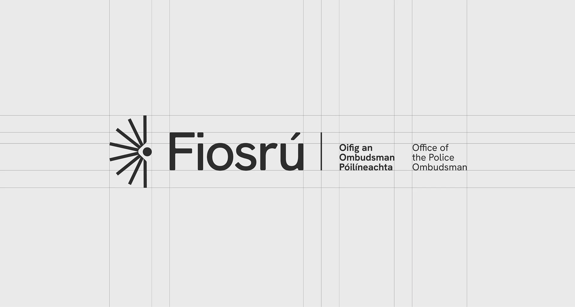
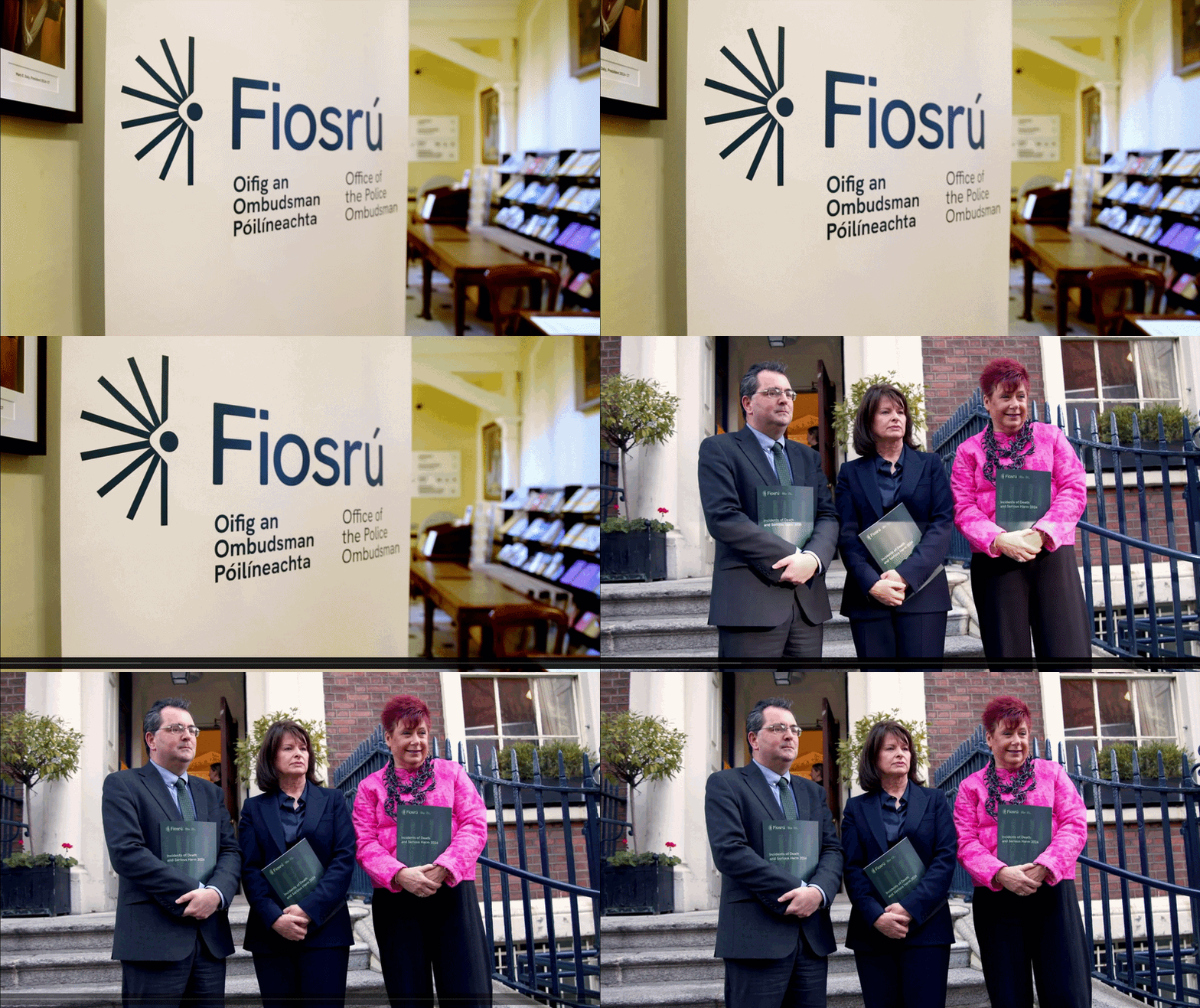
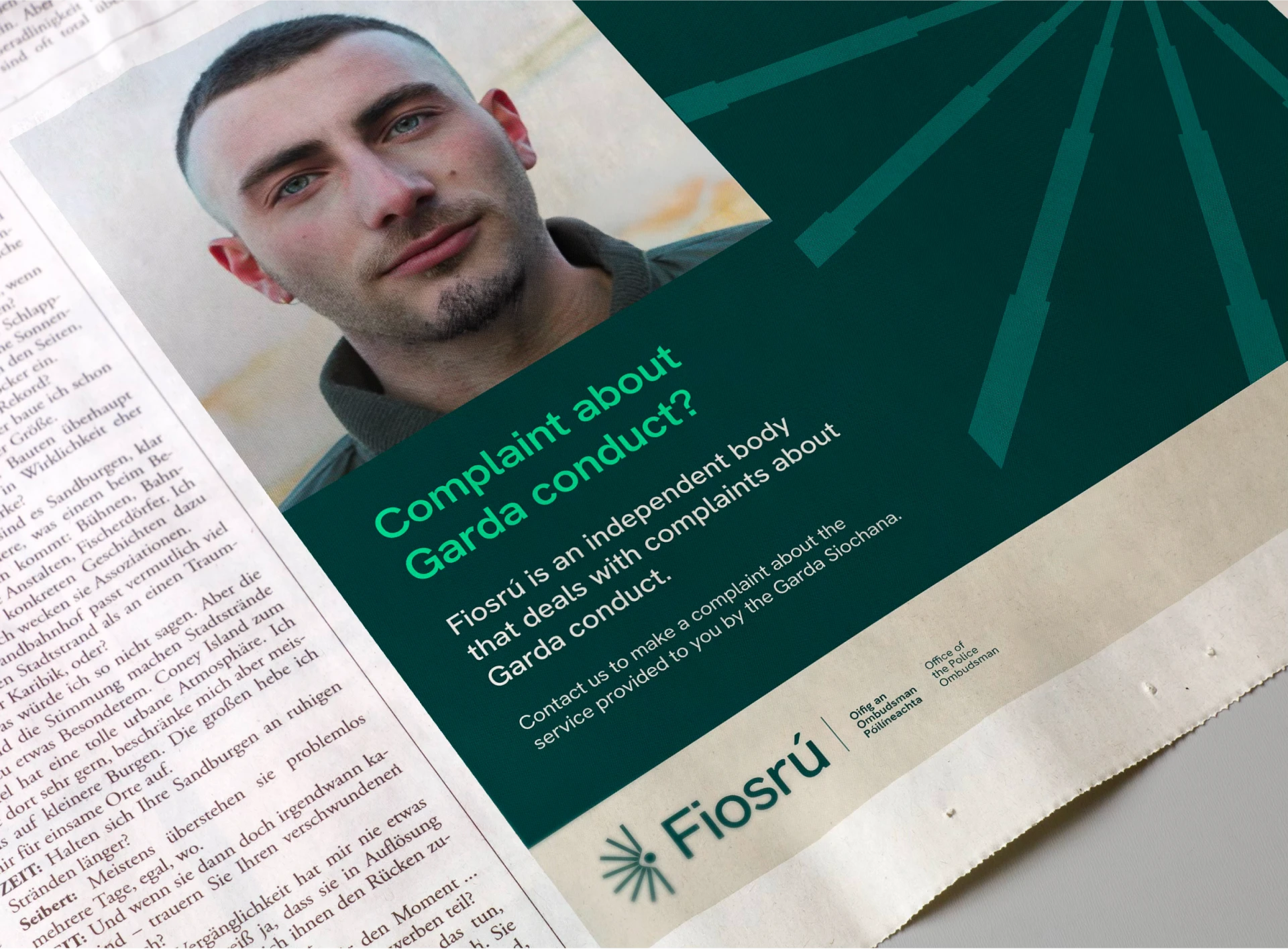
GSOC had a visibility problem that ran deeper than awareness. People conflated it with An Garda Síochána, which meant they didn't trust it was truly independent. The rebrand to Fiosrú - meaning "examination" in Irish - was a cultural reclamation. The identity had to visually separate it from policing entirely, while signalling that this was a place where difficult complaints could be brought without fear.
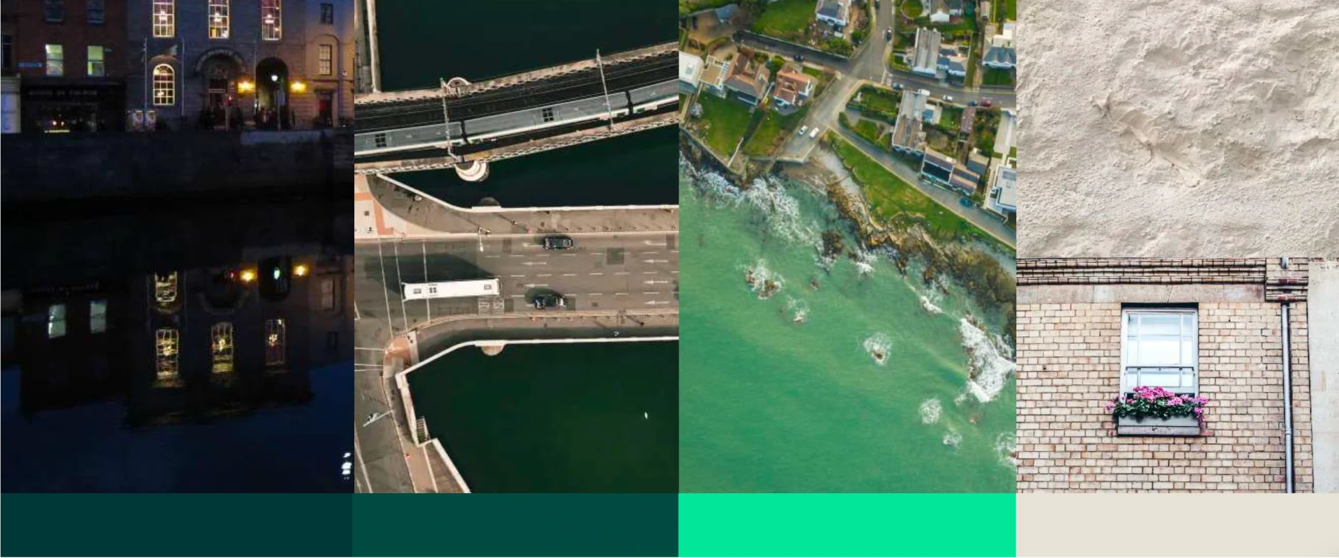
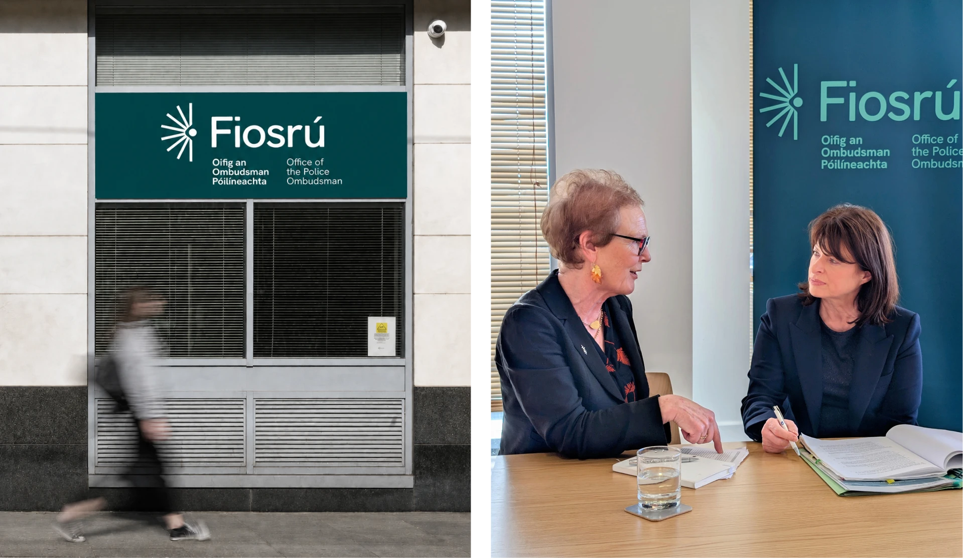
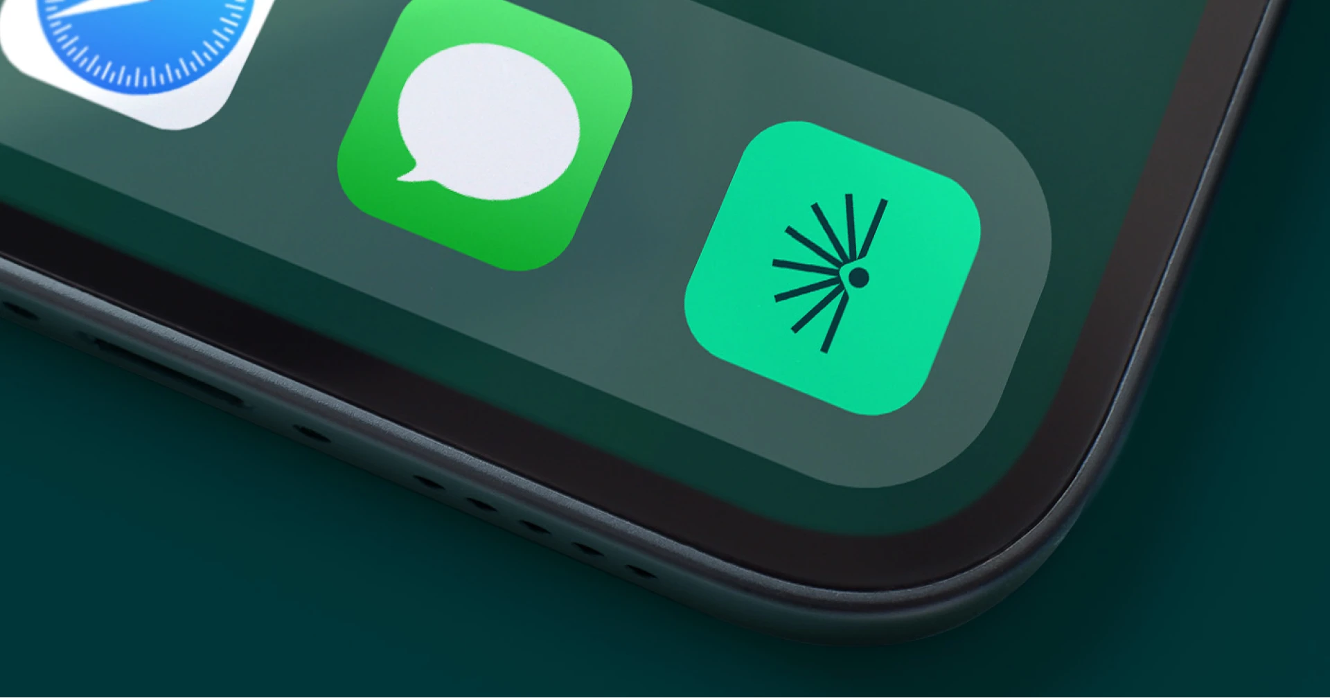
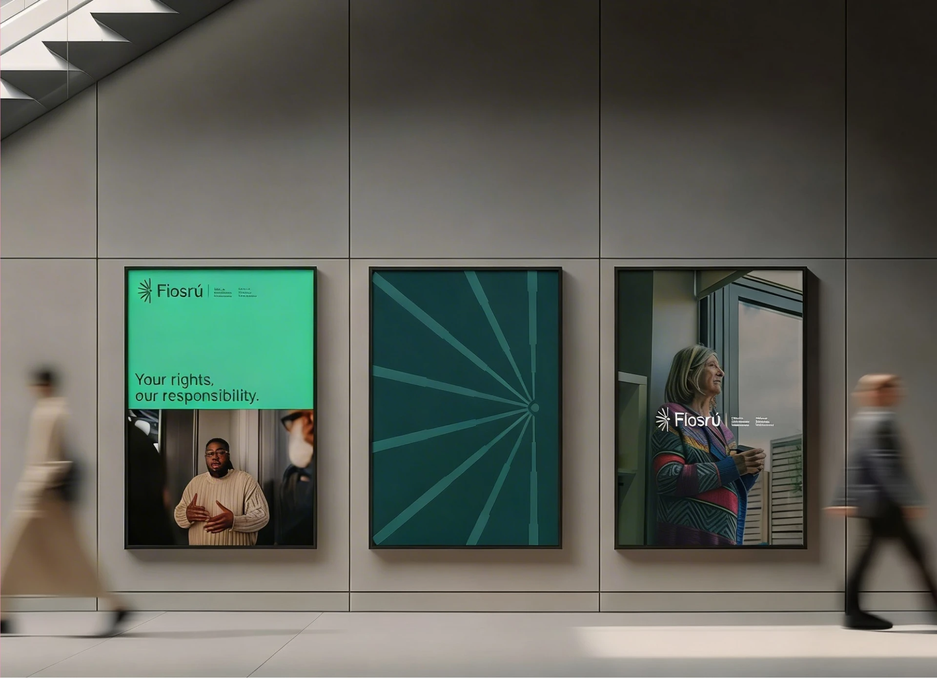
The solution was an eye shedding light. It encapsulates the three strategic demands at once: oversight (the eye), transparency (the light), and expansion (the mark becomes a pattern of rays where space allows). The colours deliberately break from Garda blue and yellow - instead, greens and beiges drawn from Irish landscape, warm and grounding rather than institutional. The round corners, clear contrast, and calm palette signal safety. This is not a scary place. It's a place that will look at what others avoid, with clarity and no judgment.
The mark works because it's confident without being aggressive. It proves Fiosrú is its own body - different, modern, serious but empathetic. For people who've been afraid to speak, the design itself says: you're safe here, and we're truly here for you.
Art direction contribution
Production & brand guidelines
Senior design contributor with Chief Design Director and Art Director
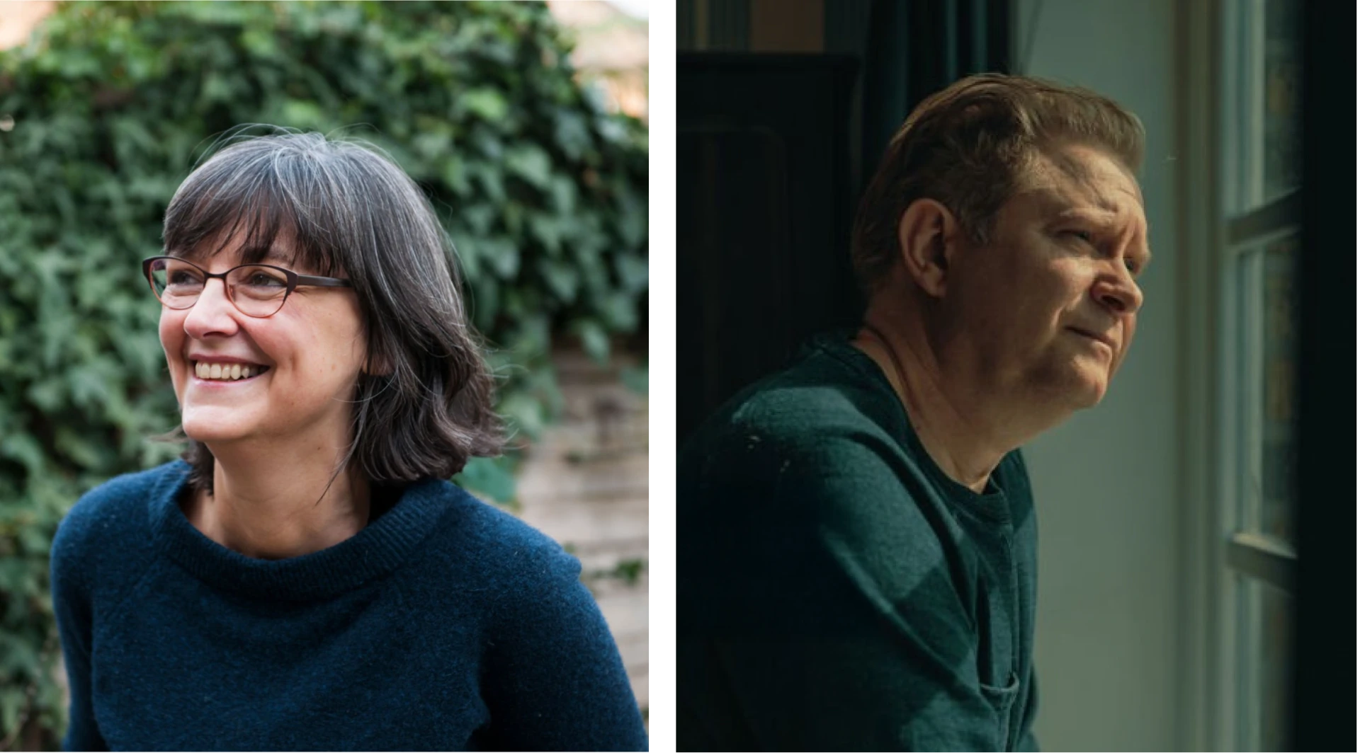
Photography and illustration direction