Letter & Grain: The quiet craft of personalization
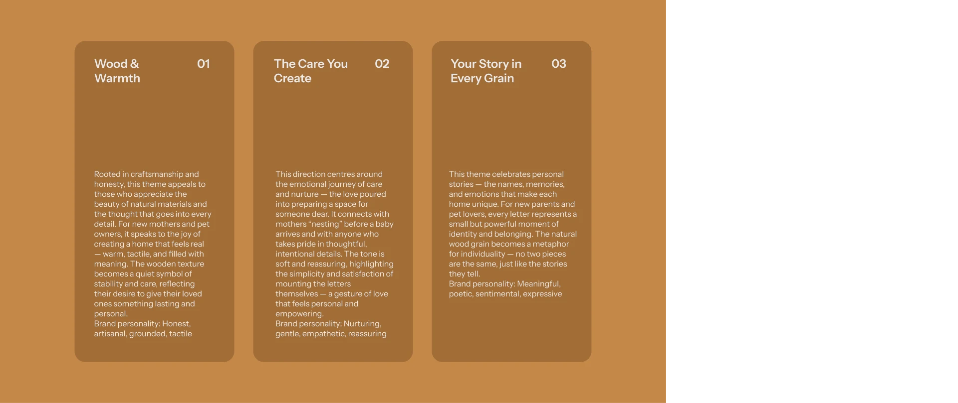
Letter & Grain makes wooden letters for children's names and pets - objects meant to mark a moment. The challenge was creating a brand that honoured the craft without overselling it, that felt special without being sentimental. New mothers in particular don't want fussy; they want calm, grounded, real.
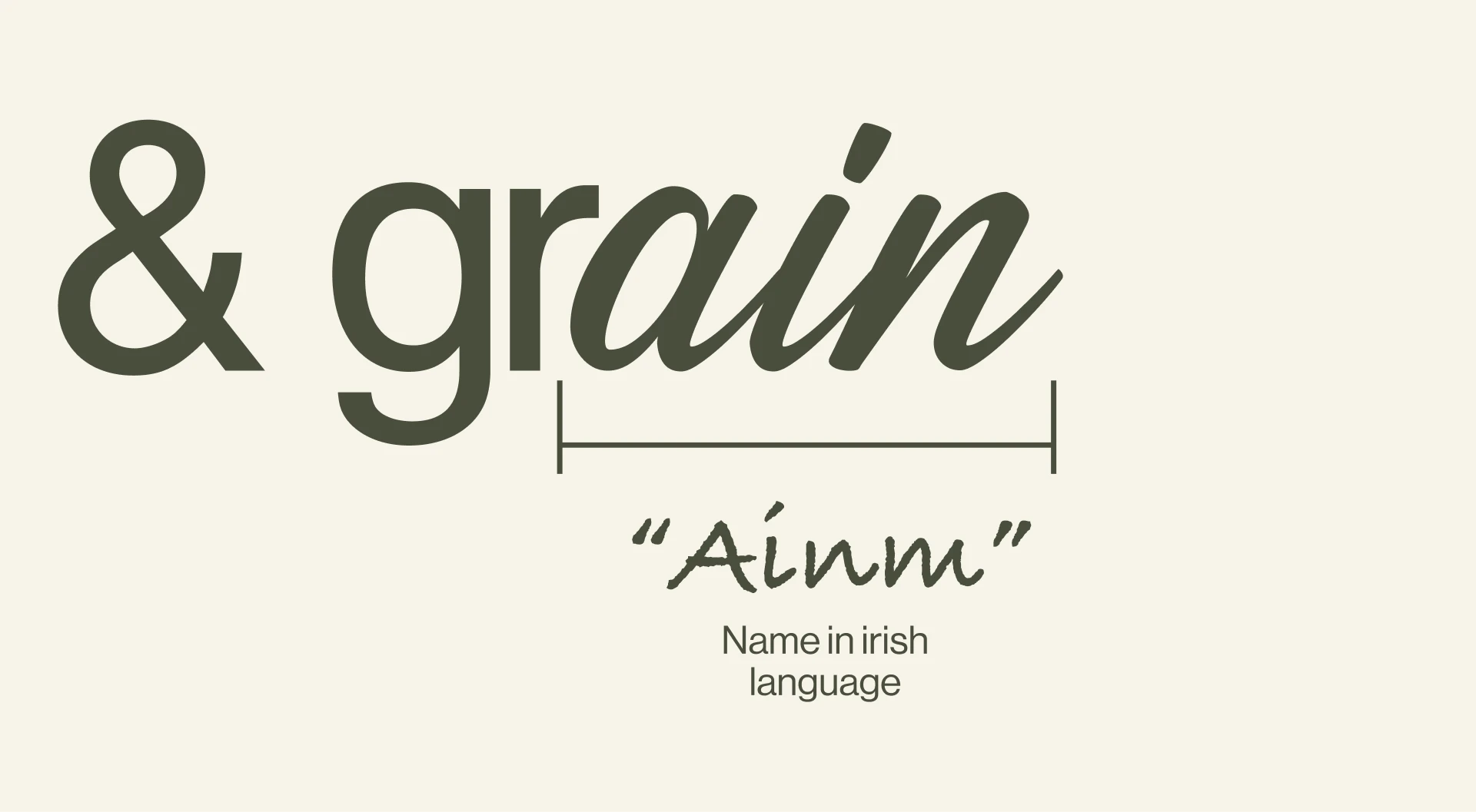
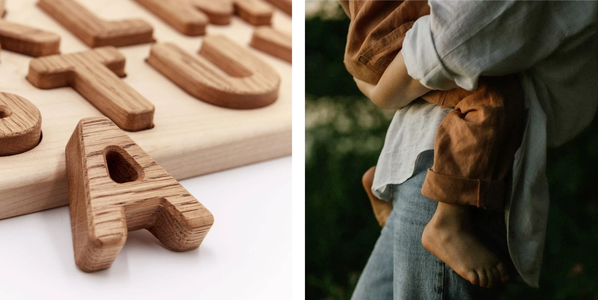
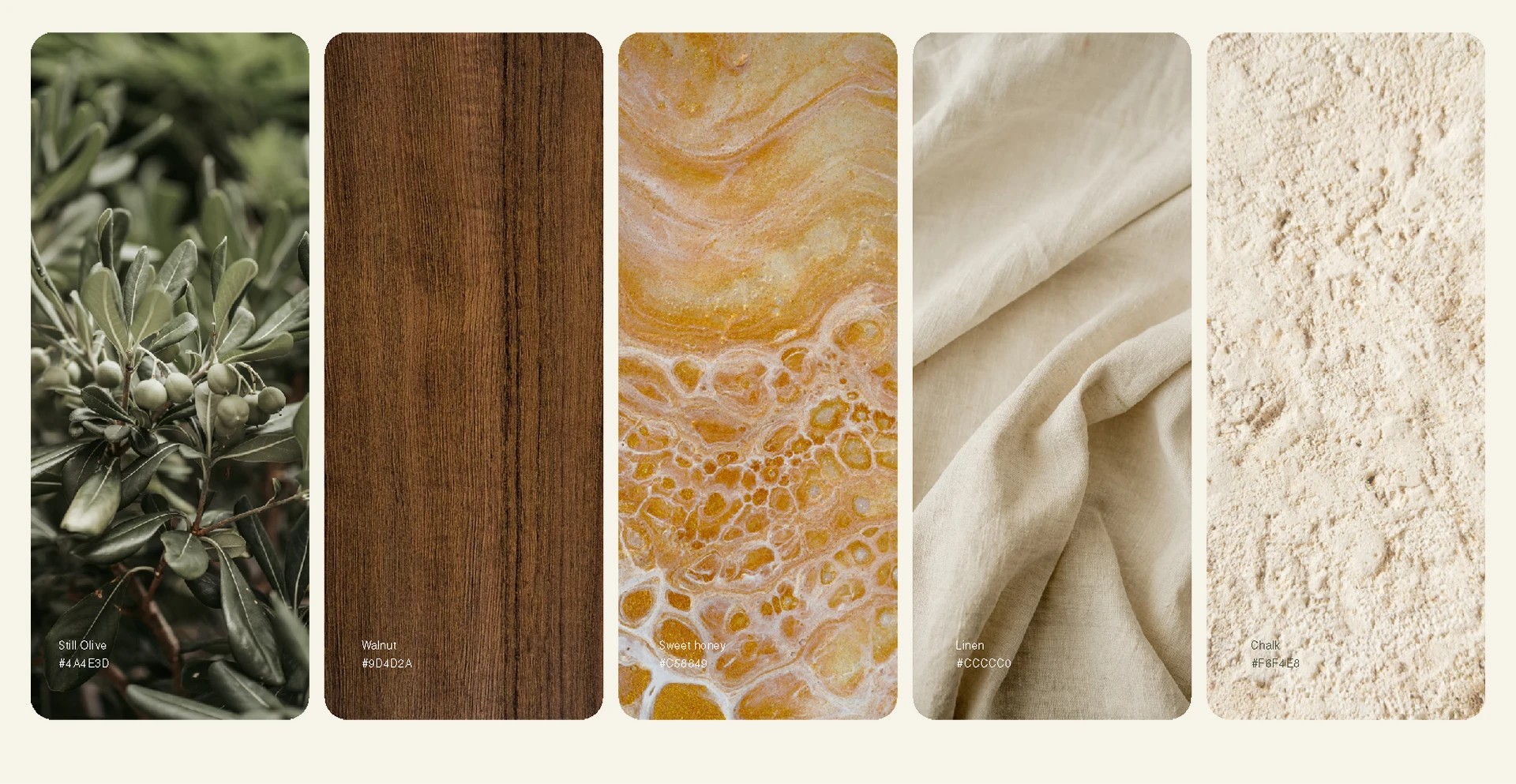
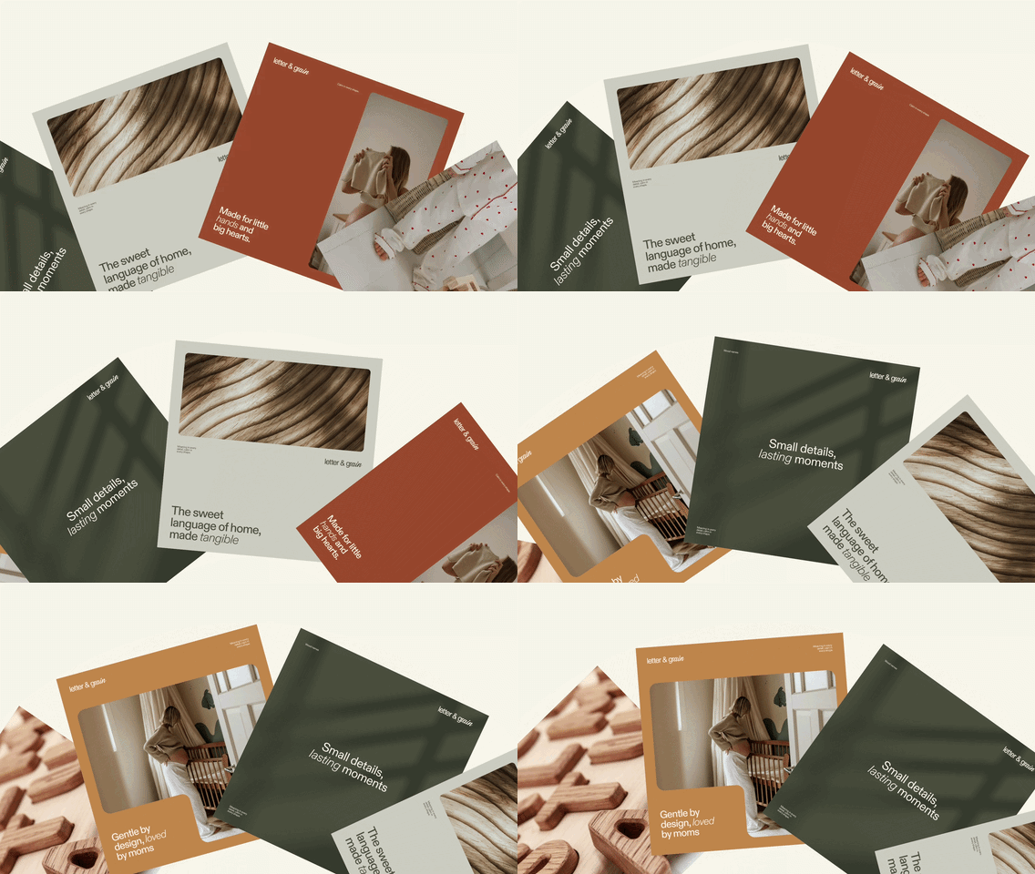
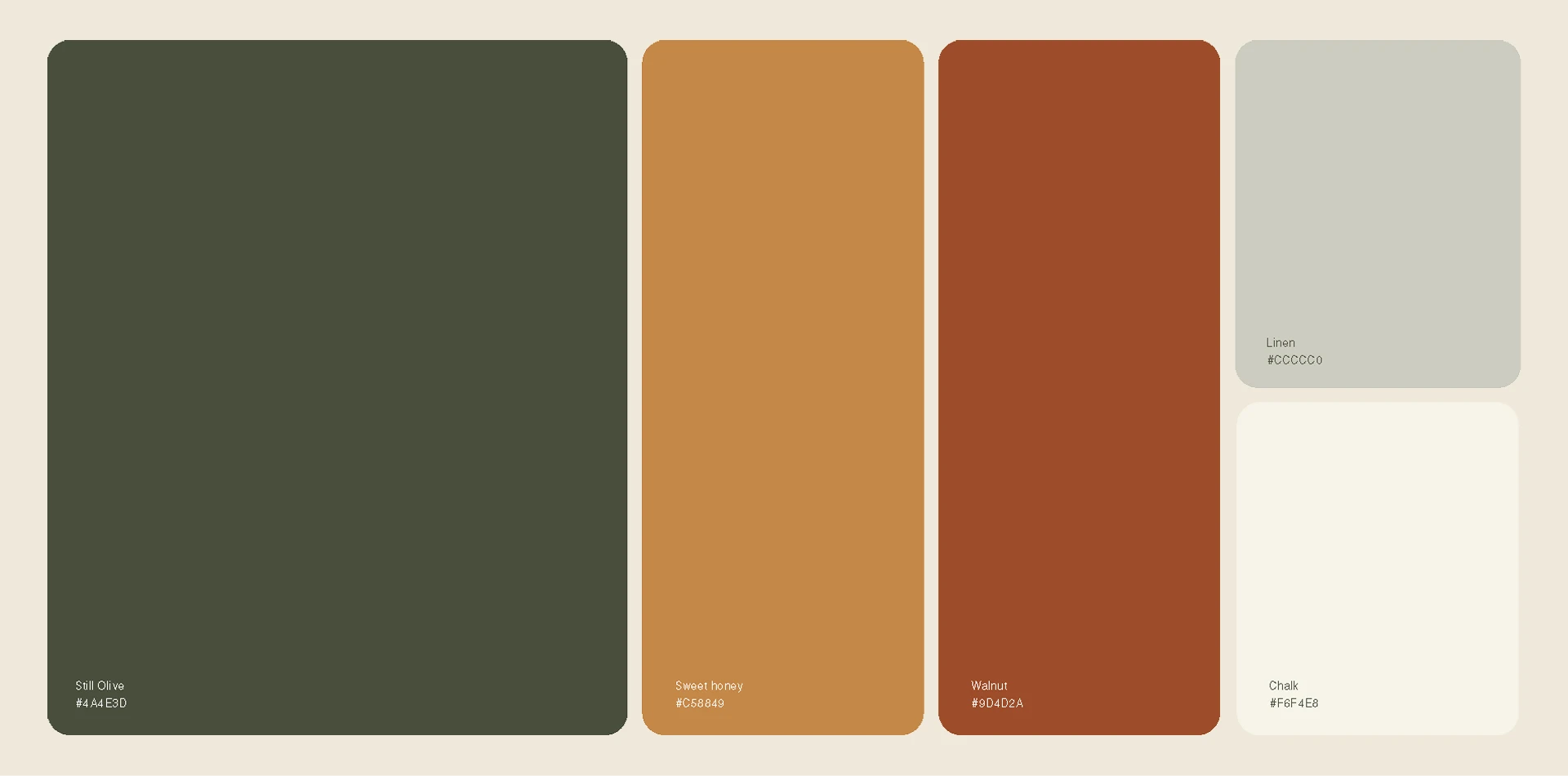
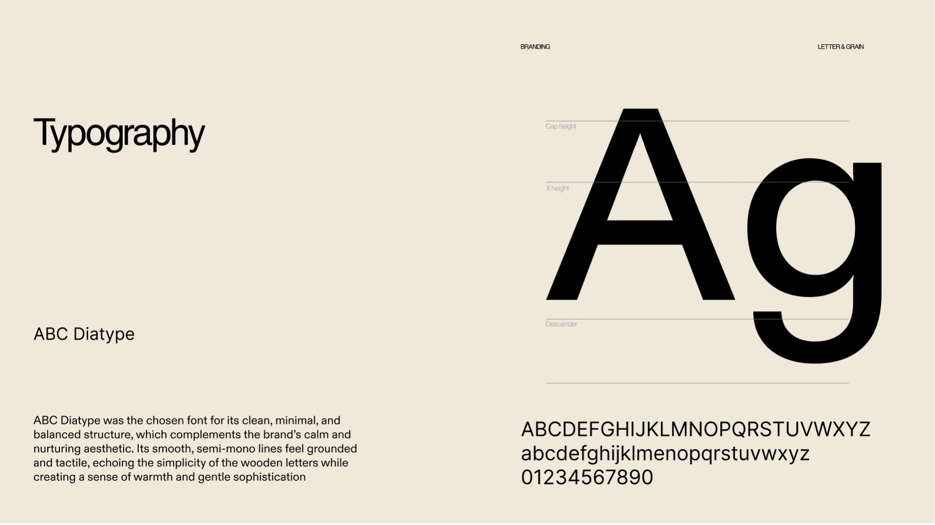
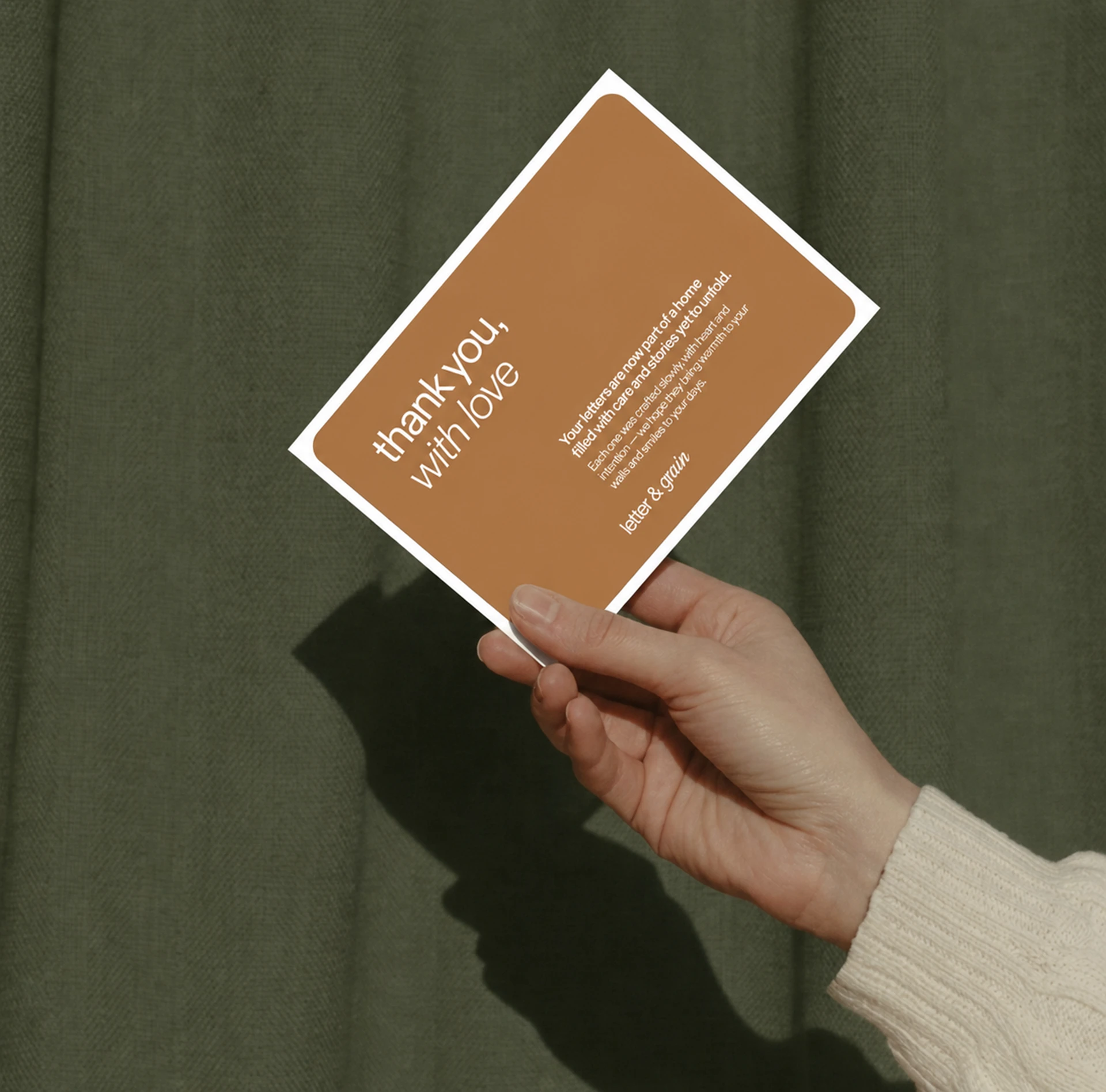
The identity strips away everything unnecessary. The mark is typographic only - the name itself, no decoration. The palette draws from natural materials: wood, grain, linen, earth. No pastels, no gendered softness, just clean minimalism that reads as intentional and high-end. The photography centres the craftsmanship and the materials, letting the wood grain and texture carry the weight. Every choice reinforces the core message: this is simple, honest work made to last.
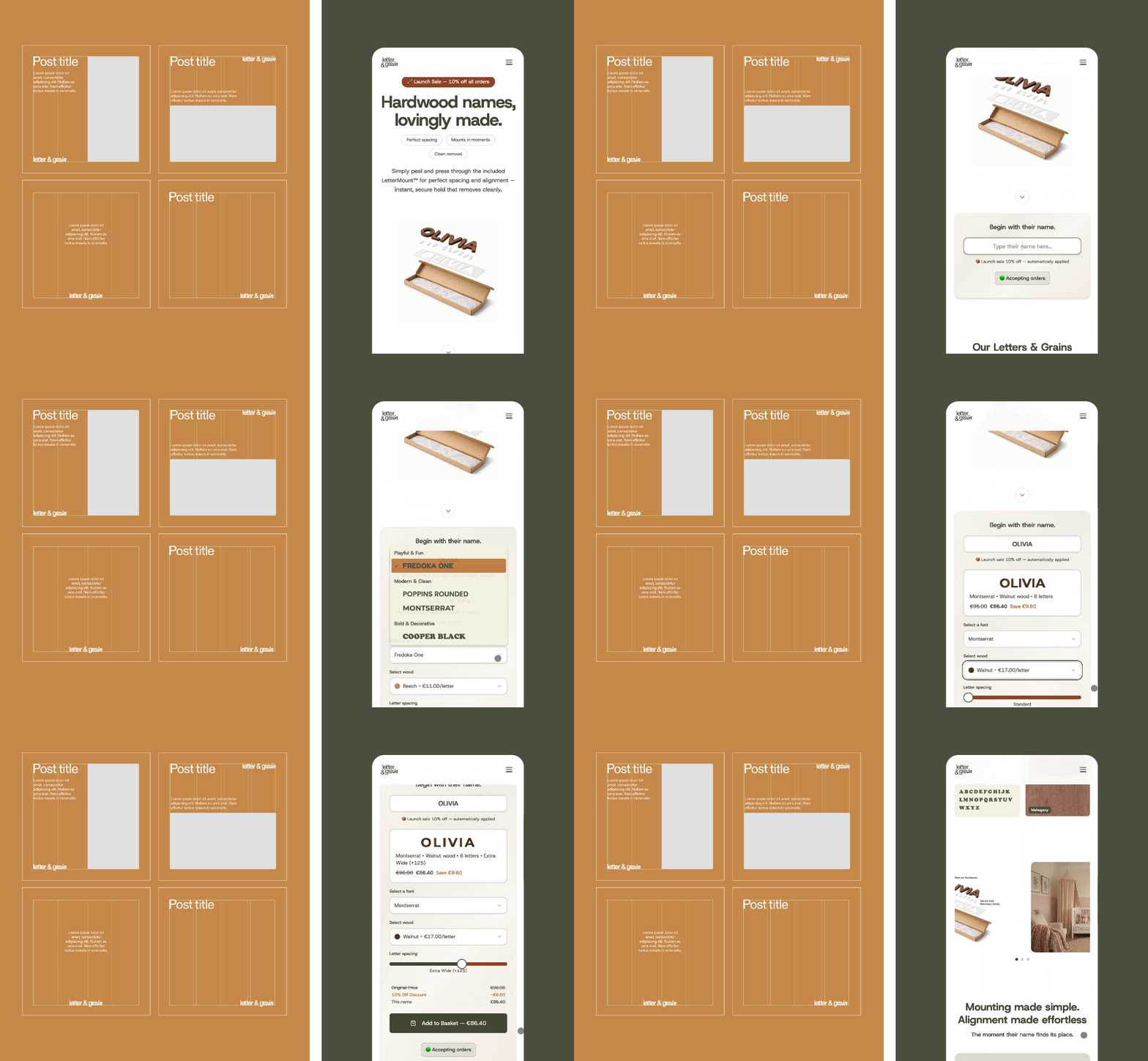
The brand works because it trusts the product. There's no need to layer meaning onto a child's name carved in wood - the meaning is already there. What mothers need is reassurance that something real and well-made will arrive, and that mounting it will be effortless. The design delivers both.
Brand identity design and art direction
Packaging and social media direction
Led project from concept through final execution (solo freelance)